The Alkaloid #8: The Quiet Death of the Pot Leaf
Walk into a high-end dispensary in Brooklyn, Toronto, or West Hollywood and try to find a marijuana leaf on the wall. You probably won't. Cannabis legalization has produced something almost no one predicted — a design renaissance. What gets left out is its own kind of statement.

THE ALKALOID
Science, culture and capital — one dose at a time.
Issue #8 — May 6, 2026
THE DOSE
The Quiet Death of the Pot Leaf
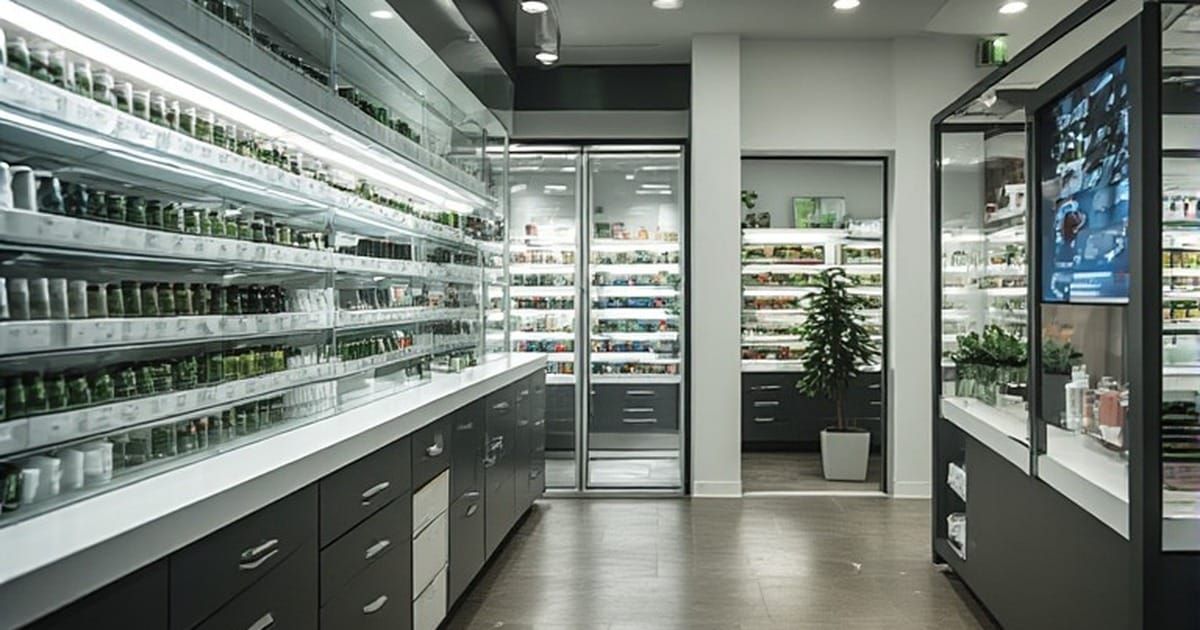
Walk into a high-end dispensary in Brooklyn, Toronto, or West Hollywood today and try to find a marijuana leaf on the wall. You probably won't. The serrated green silhouette that defined cannabis branding for half a century has become something close to embarrassing in the upper tier of the industry. In its place is something stranger and more telling. Clean serif typography. Matte forest-green packaging. Editorial photography that looks like it belongs in a Vogue spread. Glass jars designed by people who studied with Massimo Vignelli. Dispensary interiors that treat spatial experience as seriously as any gallery installation.
Cannabis legalization has produced something almost no one predicted at the outset. It has created a design renaissance.
The shift is most visible at the packaging level. The cannabis packaging industry is projected to reach nearly $2 billion in 2026, a market large enough to attract design talent that would otherwise be working on luxury skincare or boutique liquor brands. The visual vocabulary that has emerged has almost nothing to do with the imagery of cannabis itself. Brands now communicate through restrained color palettes, embossed kraft paper, holographic accents, and typography that signals confidence rather than rebellion. Roughly 70 percent of cannabis consumers now prioritize eco-friendly packaging, which has further pushed the design language toward materials that look at home in a Kinfolk magazine spread.
Dispensary architecture has followed a similar trajectory. The bullet-resistant glass and harsh fluorescent lighting that defined the medical-only era have given way to biophilic design, the defining 2026 aesthetic trend in cannabis retail. Live plant walls. FSC-certified walnut. Natural light. Diffused warm LED. New-build dispensary costs now run $100 to $300 per square foot, putting them on financial parity with high-end coffee retailers and small luxury boutiques. Sergio Mannino Studio's Soho Greenhouse in New York City reads more like an Aesop store than a cannabis shop. That is intentional.
What is happening is bigger than aesthetic preference. It is a deliberate cultural project. Cannabis brands are pouring resources into typography, illustration, and spatial work specifically to overwrite half a century of stigma in consumers' minds. Every clean serif, every matte finish, every minimalist dispensary interior is making the same argument. This is not what you were told it was. This is something else.
The argument is working. Limited edition cannabis packaging has begun to circulate among collectors the way art prints do. Major fashion weeks now feature cannabis-themed shows. Luxury brands are collaborating on limited-edition collections. Gestalten, the German publisher whose books document serious design culture, released High on Design, a hardcover survey of contemporary cannabis aesthetics. The plant has crossed the threshold from being a subject of underground design into one that mainstream design takes seriously.
Whether this is a quiet victory or a quiet loss depends on what you value. The aesthetic distance between legal cannabis culture and its underground predecessor is not accidental. It is engineered to win acceptance from a particular audience. And what gets left out of that engineering is its own kind of statement.
QUICK HITS
- Pantone's 2026 Color of the Year is informing cannabis design. Transformative Teal, the deep blue-green Pantone selected for 2026, has rapidly been adopted by cannabis brands looking to move away from neon green and harsh black. The color reads as both calm and confident, two qualities legal markets are working hard to project.
- Brooklyn's accidental archive. Photographer Vincent Pflieger collected over 1,000 discarded cannabis bags from Brooklyn streets between 2022 and 2025, photographing each one and assembling them into a project called 0.125oz. The work documents the explosion of unlicensed cannabis design in New York City just before and during legalization, capturing an aesthetic moment that is already disappearing.
- Portland was the creative catalyst. The earliest wave of design-forward cannabis branding emerged from Portland in the mid-2010s, where dispensaries like Serra connected to the city's existing community of makers and designers. The aesthetic those Oregon brands established, treating cannabis the way third-wave coffee shops treated beans, has since traveled globally.
- The leaf is back, ironically. Some boutique brands are now reintroducing cannabis leaf imagery deliberately, but reframed through retro aesthetics, vintage botanical illustration, and tongue-in-cheek nostalgia. The leaf works again because everyone agrees the era of taking it too seriously is over.
- Dispensary design firms have specialized. Architecture practices including RDC, Sergio Mannino Studio, and Harka Architecture now operate exclusively or primarily in the cannabis space, designing dispensaries, consumption lounges, and grow facilities. RDC's Set Dispensary won gold at the 2024 Shop! Design Awards in the Specialty Food and Consumables category, beating out conventional retail.
SCIENCE DESK
The psychology of perception and the rebrand
There is a useful concept from environmental psychology called the affordance, originally developed by James J. Gibson in the 1970s. An affordance is what an object or environment communicates about its possible uses, often without the perceiver consciously processing it. A door handle says pull. A push plate says push. A surface at chair-height says sit. Design is, fundamentally, the practice of arranging affordances.
What legal cannabis branding has been doing for the past decade is reorganizing the affordance signals around the plant. The old visual vocabulary, the green leaf, the tie-dye, the Rastafarian color palette, communicated specific affordances. It said: this is countercultural, this is rebellious, this is for a particular tribe. For consumers outside that tribe, the affordance signaled: this is not for you.
The new cannabis design vocabulary is doing something deliberate at this perceptual level. The clean serif fonts borrow from publishing and luxury skincare. The matte finishes borrow from premium chocolate and craft cocktails. The biophilic dispensary interiors borrow from boutique hotels. Each visual choice is selected to broadcast a different affordance: this is for you. You belong in this space. This is something a person like you might enjoy.
This is not deception. It is an honest visual argument that cannabis can be a legitimate adult consumer category alongside wine, coffee, and craft spirits. But it is also worth noticing what gets transmitted alongside the aesthetic. The new visual language broadcasts a specific class signal. Matte kraft paper and biophilic dispensaries are the design vocabulary of upper-middle-class consumption. The people the rebranding successfully welcomes in are not, on the whole, the people who built underground cannabis culture for sixty years.
Affordances cut both ways. The same design choices that signal welcome to one audience signal exclusion to another.
MARKET WATCH
The design economics of the cannabis sector have produced a meaningful new category of professional service. Specialized cannabis design and architecture firms now exist as a discrete industry, with dispensary buildouts running $100 to $300 per square foot before regulatory compliance costs. For multi-state operators expanding across markets, design consistency across locations has become a meaningful competitive advantage. Brands like Cookies, Stiiizy, and Curaleaf treat their visual identity systems with the same rigor as Apple or Nike.
The packaging side of the market is even larger. The roughly $2 billion cannabis packaging industry supports specialized print houses, graphic design studios, and material science firms working on regulatory-compliant child-resistant containers that don't look like child-resistant containers. The design challenge is genuinely difficult. Compliant packaging must protect children, satisfy state-by-state labeling requirements, avoid attracting minors, and still communicate brand sophistication. The brands that solve this problem well command premium pricing.
Investment implications worth tracking. Cannabis brand acquisitions in 2025 and early 2026 increasingly priced design and brand equity as significant components of overall valuation. The most aesthetically refined brands command premiums that pure product quality alone cannot explain. As federal rescheduling continues to be slow-walked and the November hemp THC deadline approaches, brand differentiation through design may become the most important competitive moat available to operators in markets that remain stuck in regulatory uncertainty.
The psychedelic biotech sector has not yet developed an equivalent design culture. Compass Pathways, Cybin, and AtaiBeckley present themselves visually like conventional pharmaceutical companies, with sterile white space and corporate typography. Whether psychedelic medicine eventually develops its own distinct design vocabulary, or assimilates fully into the visual language of pharma, will be a question worth watching as FDA approvals approach.
THE LAST WORD
There is something genuinely beautiful about the design renaissance legalization has produced. The matte forest-green packaging, the biophilic interiors, the editorial photography. These are real aesthetic achievements made possible by talented designers finally being able to take the subject seriously without legal exposure. The plant has, in many ways, finally been given the visual respect it deserved all along.
What is also true is that the visual vocabulary of legal cannabis is overwhelmingly engineered for a particular consumer. The clean serifs and walnut interiors and Pantone Transformative Teal speak fluently to the same demographic that shops at Whole Foods and reads Kinfolk. The communities who built and sustained cannabis culture through six decades of prohibition, communities that were disproportionately Black and brown, that absorbed nearly all of the criminal enforcement and almost none of the eventual industry profit, are largely absent from the new visual language. The aesthetic moves, deliberately and successfully, away from them.
This is not unique to cannabis. Every cultural product that emerges from a marginalized community and crosses into mainstream commercial acceptance gets visually reorganized for the audience that has the purchasing power to make it profitable. Hip-hop has gone through this. Yoga has gone through this. Jazz has gone through this. The pattern is recognizable, and it is rarely fully reversed.
The Brooklyn weed bags that Vincent Pflieger collected from sidewalks before legalization are already historical artifacts. They document an aesthetic that legal cannabis has decisively moved past. Whether they were less sophisticated than the matte kraft paper that replaced them depends entirely on who is doing the judging. They came from communities. They told stories. They had their own visual logic.
The new design vocabulary is honest about what it wants to be. It wants to belong on the same shelf as the wine and the chocolate and the artisan coffee. It is succeeding at that. The cost of that success is worth thinking about.
— The Alkaloid
Sources
- FAD Magazine — Exploring the Intersection of Art and Cannabis Culture: https://fadmagazine.com/2026/03/18/exploring-the-intersection-of-art-and-cannabis-culture/
- Gestalten — Designing a New Cannabis Culture (High on Design book): https://gestalten.com/blogs/journal/designing-a-new-cannabis-culture
- UP Magazine — 0.125oz: A Brooklyn Story on Cannabis Design: https://upmag.com/cannabis-design/
- Elevated Club NYC — Art, Identity & The New Cannabis Culture: https://www.elevatedclubnyc.com/post/art-identity-the-new-cannabis-culture
- CannaZip — Cannabis Packaging Innovation Trends for 2025-2026: https://cannazipbags.com/innovative-cannabis-packaging-whats-next-in-2025-2026/
- Sergio Mannino Studio — Modern Cannabis Dispensary Design: https://www.sergiomannino.com/project/cannabis-dispensary-design
- New Wave Magazine — The Green Renaissance: How Cannabis is Inspiring Contemporary Art: https://www.newwavemagazine.com/single-post/the-green-renaissance-how-cannabis-is-inspiring-contemporary-art
- Ouyee — Ultimate 2026 Cannabis Retail Design Guide: https://www.ouyeedispensary.com/article/cannabis-retail-design-guide.html
- Goat Global — How Cannabis is Shaping Modern Culture & Art: https://www.goatglobal.com/blog/how-cannabis-is-shaping-modern-culture-and-art
The Alkaloid publishes every Tuesday. Forward this to someone who needs the dose. Subscribe for full access: TheAlkaloid.com